

happy paws
Mobile Application
March - April 2022TL;DR
The Prompt
Client: A Canine Clinic (each group will decide on a clinic name and app name)
Clinic Services: surgeries, vaccinations, check-ups, puppy school, obedience classes, day boarding, long-term boarding.
Retail: Healthy food and treats, collars, leashes, harnesses, crates etc. The clinic wants an app that customers can use to schedule medical appointments and register for obedience training classes. There should be a "shop" component where they can purchase dog-related items.
** This task focuses more on graphic design and technical abilities, no user testing was conducted**
Our team was tasks to come up with an app design from the ground up. I’m talking app name, app logo, branding, the whole shebang! Our group didn’t waste much time and first started by ideating a name that would best suit the clinic.
We all were on the same page of naming the clinic Happy Paws - Why? because the name suggests a friendly and positive environment for pets and their owners. The name also implies that the pets who come to our clinic will be happy and well-cared for. Additionally, using a name like "Happy Paws" could help to differentiate our clinic from others in the area, as it is a memorable and unique name that stands out.
Once we settled on a clinic name we were happy with came the design of the app and clinic logo. This was a crucial step to the development of the app as it allows us to better understand the direction of the branding and the overall design approach we want to move forward with, did we want to go more playful and happy? Did we want to go more business oriented and straight to the point? These were some of the questions we asked ourselves ahead of each individually designing our own logos.
We all took some time apart, really thought of the name Happy Paws and what that meant to us. We each individually took a stab at the design but unanimously chose a design that really incapsulated the name Happy Paws and the meaning behind it. As a team we really liked the use of the colour yellow which symbolizes happiness, the design of the paw showed playfulness which all of fell in love with. The gradient is a nice touch too to make the paw pop out more. The logo was vibrant and playful which helped us in the next phase of the design and further gave us the direction and approach we wanted to take with the app.
Ideation

Our Approach
A brief overview of our team, we were a group with a wide variety of skills within the UX field, I’m talking great researchers, graphic designers, user testers, you name it. We decided our team of six into two teams to get the most out of everyone abilities and strong suits. One team focused on the wire framing of the app and really establishing the needs and requirements the app needed. These folks had a knack for researching possible user needs and competitive analysis, their main goal was to lay the ground work to make sure we covered our bases before they hand off the design to the other team. The other team focused on further branding, such as colours and typefaces to use, as well as piecing together what the overall product will look like on Figma. These folks have an aptitude for putting it all together, seeing the work come alive, and have a technical ability with design software.
My role was in the second team putting together the branding and putting the app together. Opposed to the tasks mentioned earlier for my team, I was in charge of making sure all of the pages were consistent with branding we put forth and that all of the pages, buttons, components were linked properly.
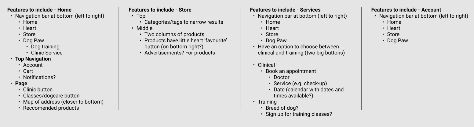
The layout team were absolute rockstars for laying the ground work for what it was we needed and areas to consider
I know it looks like a mess but let’s dissect this together

Interact with the prototype!
Scan the QR code to try it on your phone for the best experience!
Happy Paws is a mobile app created for a mobile clinic that all allows customers to schedule medical appointments, register for obedience training classes, and purchase dog-related items. The mean of five split up into two teams, focusing on wireframing and research, while the other team focused on branding and putting the app together. No user testing was conducted.
Status: CompletedLayout


We took their design and slowly turned it into this…


