
Saichologist - Built for care providers—an intuitive mobile platform that captures, transcribes, and analyzes sessions.
TL; DR
This project focuses on designing a mobile extension of an existing AI-powered web platform that helps clinicians record, transcribe, and analyze therapy sessions while ensuring GDPR compliance. My role involved adapting the experience for mobile, optimizing usability for on-the-go clinicians, and maintaining seamless integration with the web app. Through research, UX design, and system thinking, I crafted an intuitive, efficient, and privacy-conscious solution that enhances clinical workflows.
Project Type
End-to-End Mobile Application, Product Discovery
Roles
UI Designer, User Researcher, Animation
Project Duration
Feb. - May 22’
Background
The Problem Where We Started
Before being on-boarded on the team, the team had already established and AI solution to help clinicians best organize their their thoughts and ideas with AI.
The team already had a web application and needed me to develop a mobile companion? to coincide with the web application.
The challenge? what does it look like and how does this all fit into play with the clinicians workflow
My Impact
UX & Product Design: Led the end-to-end design process, from research to high-fidelity UI.
Information Architecture: Restructured the platform’s IA for scalability across web and mobile.
Interaction Design: Designed intuitive workflows for session recording, transcription, and review.
AI Integration: Defined AI-driven features like live transcription, sentiment analysis, and smart summaries.
Design System: Established a cohesive design system for consistency across all touchpoints.
Main Research goals —> The need for the product as a whole
My awesome team had already conducted some research prior to my arrival but I needed to see it and hear it for myself
Secondary Goals —> Where does a mobile device fall into place in regards to clinicians' workflow
Building a solution for international students? — Is it even worth it?
1.Research
Research Goals
Evaluating the Competition
To qualify as a competitor, platforms had to meet at least two criteria:
University support services
Student networking
Community building
Mental Health & Wellness Resources
Nice to have but not mandatory:
Centralized & Easy-to-Navigate Services
Multilingual accessibility
Identify unique pain points international students have in comparison to domestic students
Pain Points That Shape Our Design
Based on our research, international students face significant challenges in building connections, accessing resources, and overcoming cultural and language barriers. By identifying key pain points and user needs, we were able to design a solution that directly addresses these gaps, ensuring a more supportive and inclusive university experience.
Student awareness of current resources either from the university or external
Who are our users & what are their tendencies?
Who are our users & what are their tendencies?
What is currently available for students? — competitive analysis
Establish the severity of pain points based on occurring frequency
What do the university’s current efforts look like?
Uncover potential remedies to address the pain points
Uncover potential remedies to address the pain points
Rather than tackling a solution for all university students, we narrowed it down to focus solely on international students. But what does that look like at Wilfrid Laurier University?

I’m not going to bore you with all of the nitty gritty details of our findings, but here is the quick rundown of what we gathered:
Competitor Insights & Opportunity
✅ What Works: Other universities, like Waterloo and McMaster, offer international student support, ensuring access to mental health resources and university services.
❌ Where They Struggle: Their approaches to mental health are often generic, failing to address the unique challenges international students face. Language barriers make it difficult for students to navigate mental health conversations, and direct support in languages other than English is limited. Additionally, wellness institutions often lack international representation, making students feel disconnected.
💡 The Opportunity: A mobile-first platform tailored specifically to international students, offering multilingual support, culturally relevant mental health resources, and a stronger sense of community—bridging the gaps that current university services leave open.
Wilfrid Laurier University
From the university, we spoke to Peter Donahue – associate director for International Student Support at Wilfrid Laurier University
Challenges faced:
Language barrier between school and student
No true /inconsistent form of communication from WLU
Lack of awareness to resources for international students
International students normally go through a culture shock in their first year on campus
Because of this, all the effort that he and his team try to build doesn’t end up living up to its full potential for the students.
Who we talked to — user interviews
Empathizing with our users
International Students
From interviews with eight international students from the Middle East, China, India, and parts of Africa, several key insights emerged about their mental wellness experiences:
Challenges faced:
Experiencing culture shock and unique stressors distinct from domestic students.
Struggling with language barriers when communicating with counselors, hindering effective articulation of feelings.
Difficulty finding groups or individuals with shared cultural or religious beliefs.
Lack of awareness about available mental health resources and where to find them.
Current practices:
Bottling up emotions due to cultural taboos around discussing mental health struggles.
Feeling isolated and unable to find support groups or communities nearby.
These findings highlight the need for culturally sensitive and accessible mental health support tailored to international students’ specific needs.
“I felt a little overwhelmed and different from the others. I wasn't able to connect with many international students”
- Fares, Fourth Year Econ, Palestine
"It was a culture shock attending a Canadian university. I missed O-Week and orientations because I didn’t know where to go or have anyone to go with, which I regret as I don’t know many people in my class. While I’ve made a few friends, none share my culture or religion, and I never connected with the Syrian community at Laurier."
- Ayham, Third Year Comp. Sci, Egypt
“I felt I was in a different world when I first came to Laurier. Everything was new, from the people, the culture and the environment. It was my first time being so far from my country; I was extremely homesick.”
- Jack, Third Year Business, China

Key Takeaways
1️⃣International students crave connection to person(s) or community but don’t know how or where to look. The university struggles to communicate effectively, resulting in a disconnect between available resources and the students who need them most.
2️⃣ This gap leads to feelings of isolation, difficulty accessing support, and underutilization of services designed to help them succeed. Clearer communication, culturally relevant support systems, and dedicated community-building efforts are essential to fostering a sense of belonging and ensuring international students thrive academically, socially, and emotionally.
3️⃣ We needed to create something easily accessible for international students to get a hold of the resources they need without having it be a big thing—something intuitive, culturally inclusive, and seamlessly integrated into their daily lives. This solution should bridge the gap between students and the university, fostering clear communication, promoting community-building, and ensuring that no student feels lost or unsupported in their journey.
2. Define
Personifying our users
Research revealed that international students face challenges such as cultural differences, language barriers, and limited support systems, leading to isolation and difficulty integrating into university life. Existing resources are often poorly communicated or insufficient for their needs.
This insight led us to define our primary user archetype, "The Broken Compass," which helps us understand complex behaviors and dynamics, enabling us to design tailored solutions and foster meaningful connections.
Before diving into design, we needed a clear understanding of the challenges our potential users may face in finding, sharing, and discussing information.
Defining our research goals helped ensure we were solving the right problems with the right solutions.

How will we do it? Why mobile first?
Making sure we ask the right questions
How might we create a more accessible and visible support system that helps international students easily find and connect with resources?
How might we bridge the communication gap between the university and international students to ensure they are aware of and can access mental health and community support?
How might we design a platform or system that fosters a sense of belonging and connection for international students, helping them find peers with similar cultural and religious backgrounds?
How might we reduce the barriers caused by language and cultural differences to ensure international students feel comfortable seeking help?
Core Features for an Impactful Experience
🤝Community Matching
Helps students connect based on shared culture, language, religion, hobbies, or academic interests.
📚Centralized Access to Resources
Streamlines university services, mental health support, and academic assistance into one platform.
💬Real-Time Chat & Forums
Allows students to ask questions, share experiences, and seek advice instantly.
📅Group & Event Discovery
Enables students to find and join student organizations, cultural events, and networking opportunities.
🗣️Multilingual Support
Ensures students can fully express themselves and engage with the platform in their preferred language.
🔔Personalized Notifications
Keeps students informed about deadlines, opportunities, and relevant resources tailored to their needs.
Many university platforms are outdated, web-based, and difficult to navigate on mobile. Their formal, institutional feel creates barriers for students seeking a more supportive environment.
By designing a mobile-first experience, we provide international students with an intuitive way to connect, access resources, and find support—right from their phones, whenever they need it.
3. Designing

We started with ideating a peer system flow including very basic information about the students such as: name, program, year, major and university campus. We brain stormed the idea of having a voice chat or text chat function where users are able to communicate in their own language and be automatically translated for the other peer / user.

We needed to figure out how we could match peers in the first place, a part from people in your proximity being from the same school, year or program, we wanted to broaden the search query in the case there are special or key areas the user was interested in.

All of the conversations and chat logs will look relatively similar to most chat log platforms. No need to reinvent the wheel.

Generated a map of user flow housing where elements will go on the app.
👥Participants
We tested with four international students from Wilfrid Laurier University
two male and two female
ranging in the age from 18-22.
Three participants were enrolled in in-person classes and familiar with the university’s existing digital products (web and mobile applications)
One was taking remote classes and had no experiences with these platforms.
🔍Expectations
Participants were asked to complete four tasks within the application to the best of their abilities.
Method: Think aloud
Throughout the process, we observed their interactions, questioning why they clicked certain buttons and what they were drawn to while navigating through the app.
4. Testing
Pre-testing
📊Data Collection
We documented results using table-style forms and recorded participant responses in as much detail as possible. When users struggled to articulate their decisions, we rephrased our questions or prompted them further to understand their thought processes. The majority of data collected was qualitative, relying on verbal responses and detailed notes taken throughout the testing.

Summary of User Testing Feedback
Successes and Key Features Appreciated
✅Real-Time Translation: Users liked the inclusion of both original and translated text.
✅Event Calendar: Found to be intuitive and helpful.
✅Bookmark Section: Valued for quick links, personalized resources, and its emphasis on individualization.
✅Design and Layout: Organized, simplistic layout, particularly in the topics section.
✅Personalization: Features like bookmarks, chat topics, and event calendars enhanced the sense of customization and individuality.
Failures/Areas for Improvement
❌One of the most compelling insights from user feedback was the need for an anonymous option. Many international students expressed hesitation in openly sharing their thoughts and experiences, especially when discussing personal challenges.
❌Another critical area for improvement was language accessibility. While the app offered multiple language options, users found it difficult to locate or change their default setting.
❌Peer-matching experience lacked confirmation feedback, leaving users uncertain if their match request had gone through.
5. Final UI
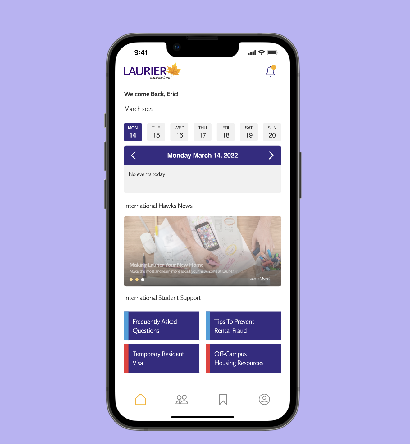
One issue faced by both the university and international students was a lack of awareness about events. To address this, we plan to feature targeted content on the homepage, including virtual and in-person events, webinars, and workshops.

We developed a peer-to-peer support mentoring program that connects international students with trained student ambassadors, offering academic, social, and cultural support to foster community and ease the transition to university life.

Peers can be found using keywords through our Topic Search function to find common ground before being matched.


We featured an improved messaging system allowing users to voice themselves in their native language through voice and translate function to overcome language barriers and ensure clearer, more effective communication with international students.

Granting users the ability to be anonymous prior to being matched ensures a safe and comfortable environment, allowing them to engage without the pressure of revealing personal details too soon. This feature promotes honest and open communication, reduces anxiety, and encourages users to focus on building meaningful connections based on shared interests or needs before disclosing their identity.

Additionally, we'll provide an online platform with tailored resources to tackle common challenges such as language barriers, culture shock, and homesickness, ensuring accessibility for all students.

To enhance user experience, we will implement a bookmark feature that allows users to save and easily access their favorite resources or important information. This feature will help users efficiently manage and revisit content relevant to their needs, improving navigation and engagement within the platform.
6. Learnings
1️⃣The Failure of One-Size-Fits-All Solutions
Generic platforms often fail minority users by overlooking their unique challenges, leading to frustration and exclusion. Addressing these gaps requires intentional design that prioritizes their needs, aspirations, and lived experiences. In our project, we tackled this by implementing essential features such as real-time translation with both original and translated languages, as well as anonymity options—ensuring users felt seen, heard, and supported.
2️⃣Empathy-Driven Design Leads to Meaningful Impact
Designing for a marginalized group isn’t about limiting reach—it’s about fostering inclusivity. Through user feedback, we learned that personalization is not just a “nice-to-have” but a crucial component of engagement. Participants valued features like bookmarks and tailored topics because they didn’t just want tools; they wanted tools that felt designed for them.
3️⃣The Power of Intentional Design
When you design for those on the margins, you don’t just solve a niche problem—you create solutions that resonate with a wider audience due to their thoughtfulness and depth. This project reinforced that by prioritizing the voices of those often unheard, we don’t just build functional products; we create experiences that empower, validate, and foster genuine connections. The key to sustaining this impact is continuously listening, evolving, and refining based on user feedback.